« If you just do form, then you are doing sculpture, but if you look after the interaction between life and form, you are doing architecture. » Jan Gehl
Duisburg
Landschaftspark
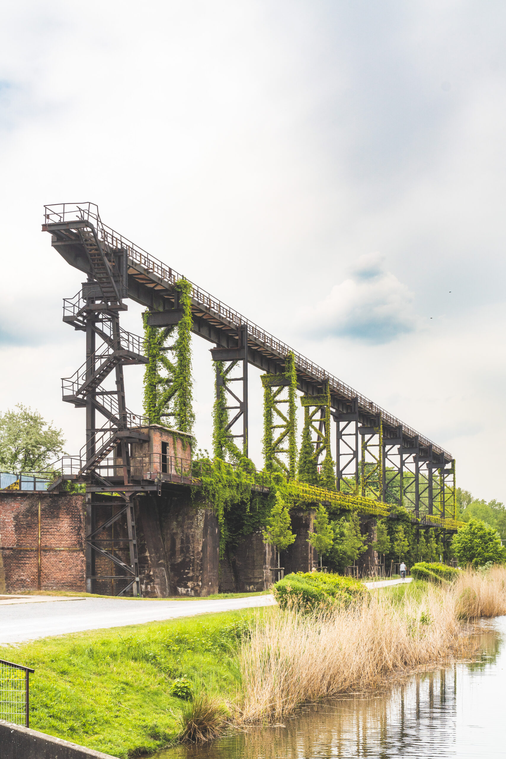
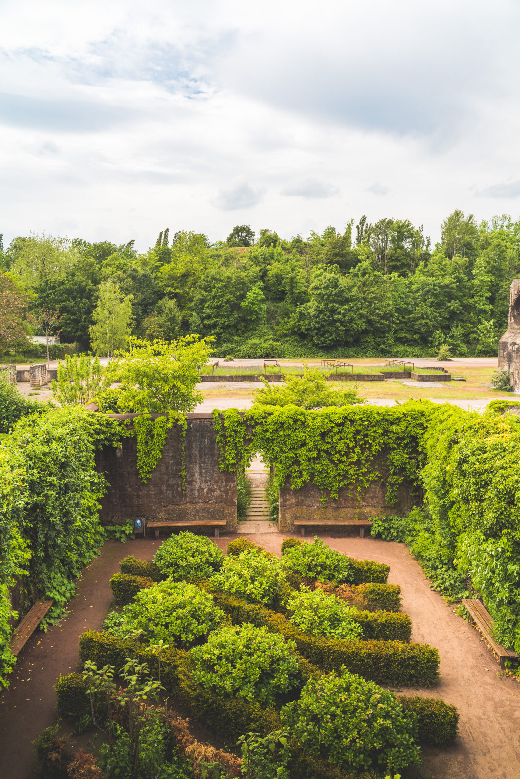
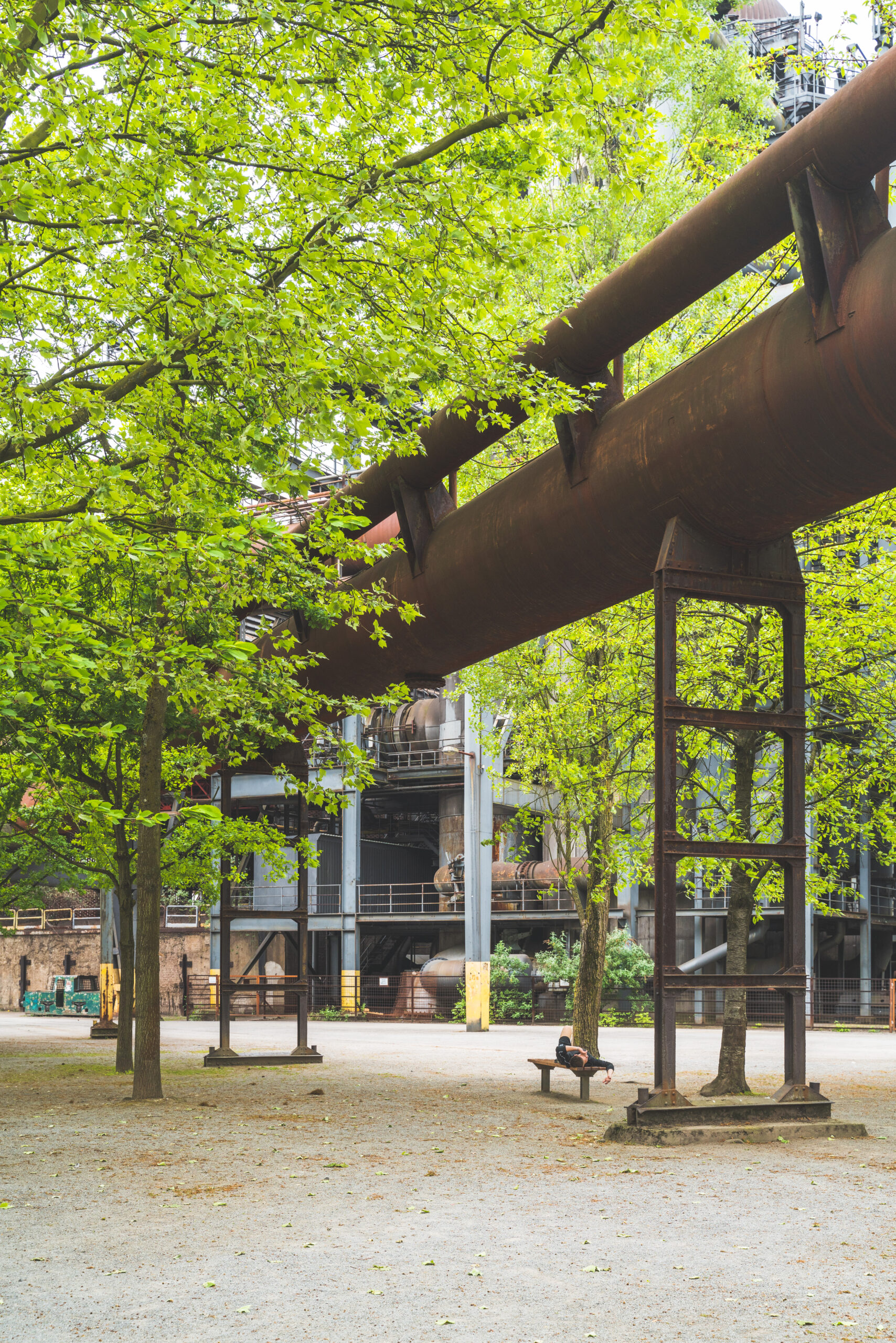
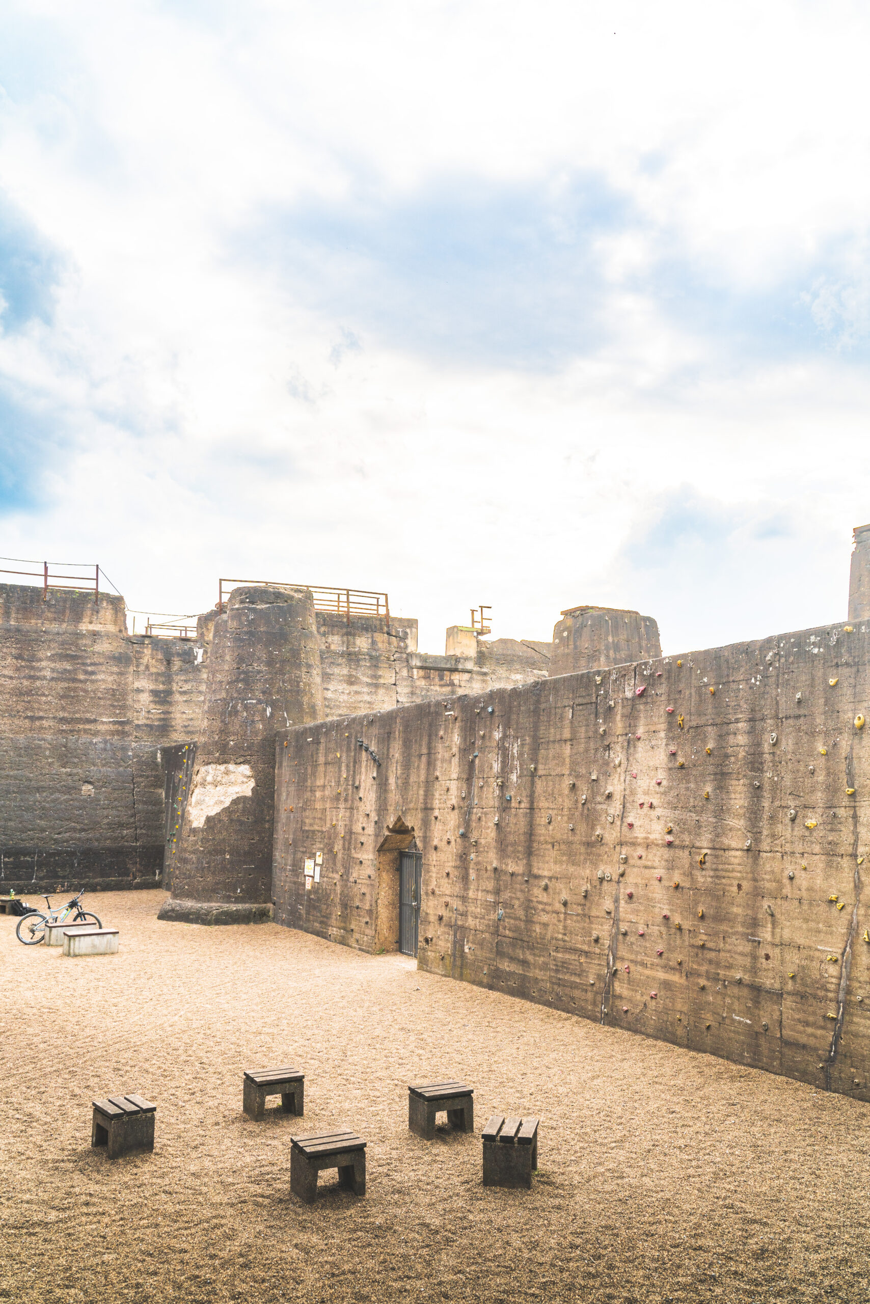
To start things off, I headed to landschaftspark, located a bit north of Duisburg. The facility used to a coal and steel industry that shut down in the mid eighties. It was only abandoned a couple of years before a landscape competition was thrown. Latz & partner, the winners of the competition, had only one line of thought : they wanted to sublimate the industrial past rather than deny it. And so it became one of the first industrial revalorisation of that kind and scale. One that would inspire generations of landscape architectes and preserve hundreds of abandoned industrial facilities. Even more than that, it demonstrated that if reusing a complexe industrial site was possible, then any place could be rehabilitated and find a new purpose. A precursor idea for a real sustainability doctrine.
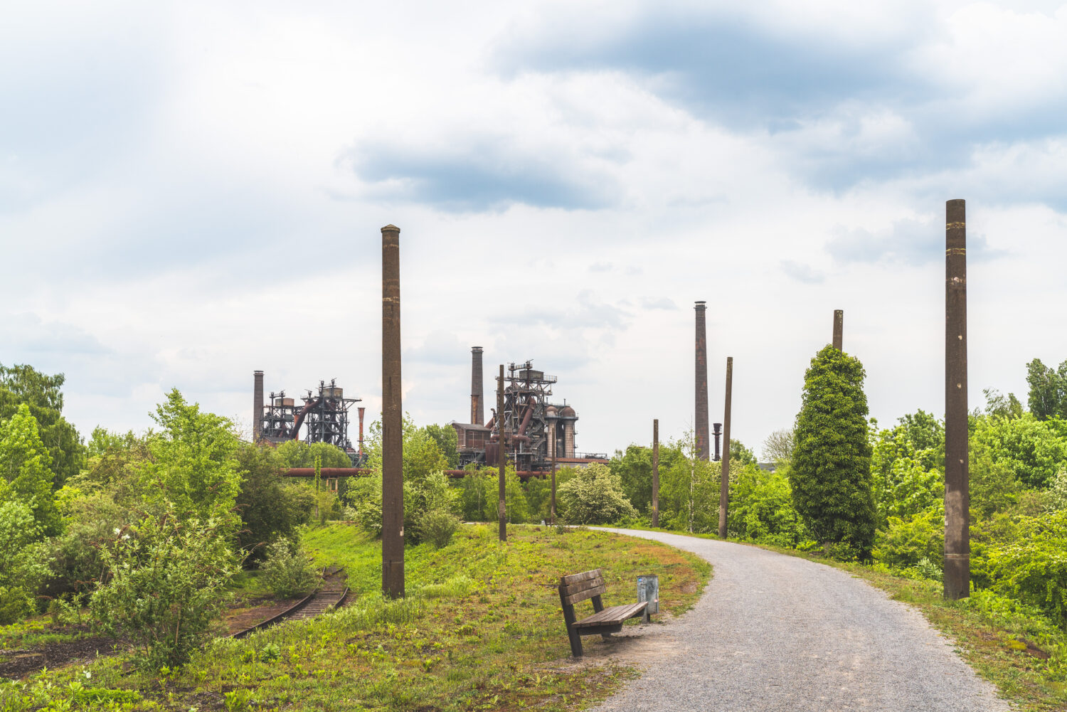
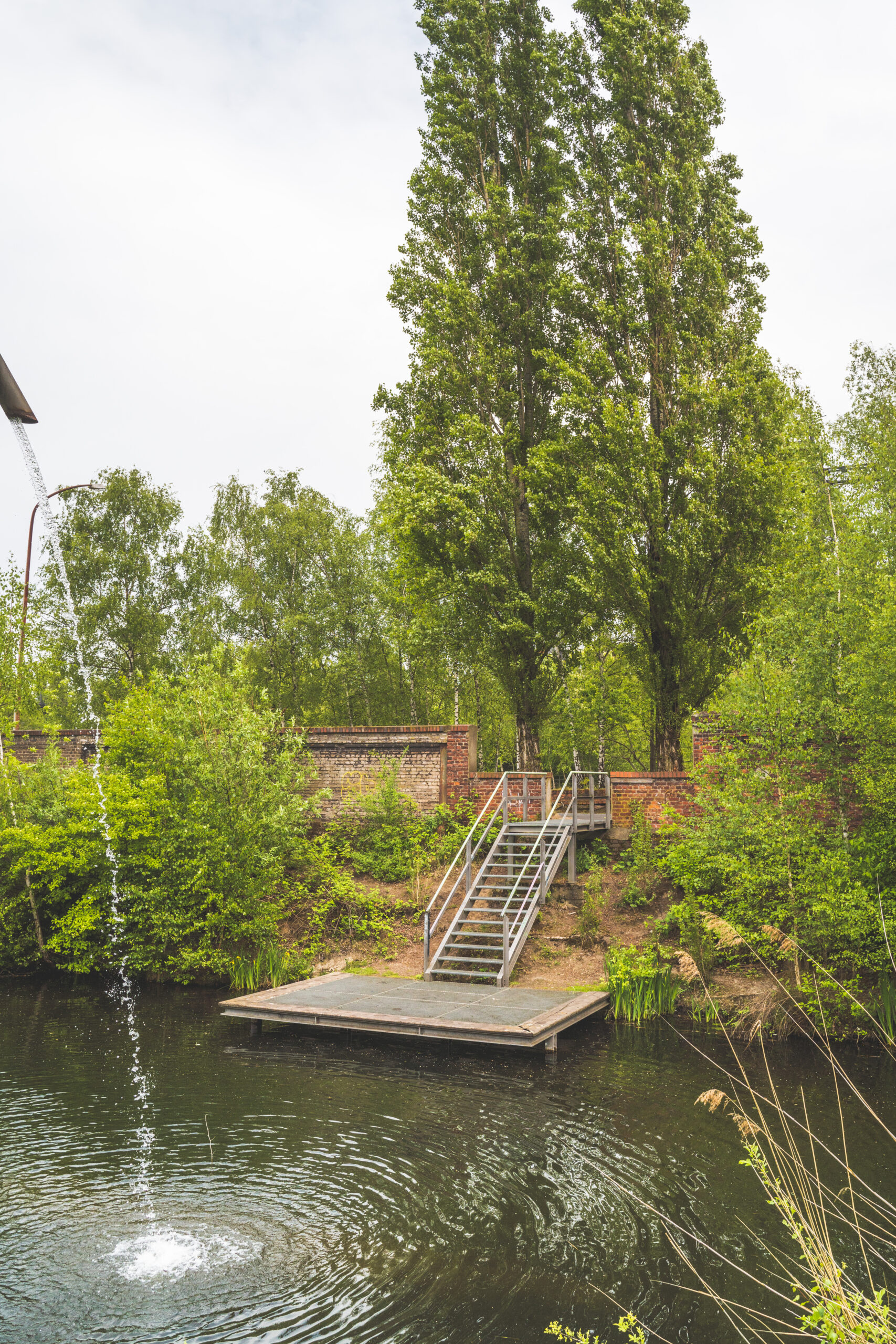
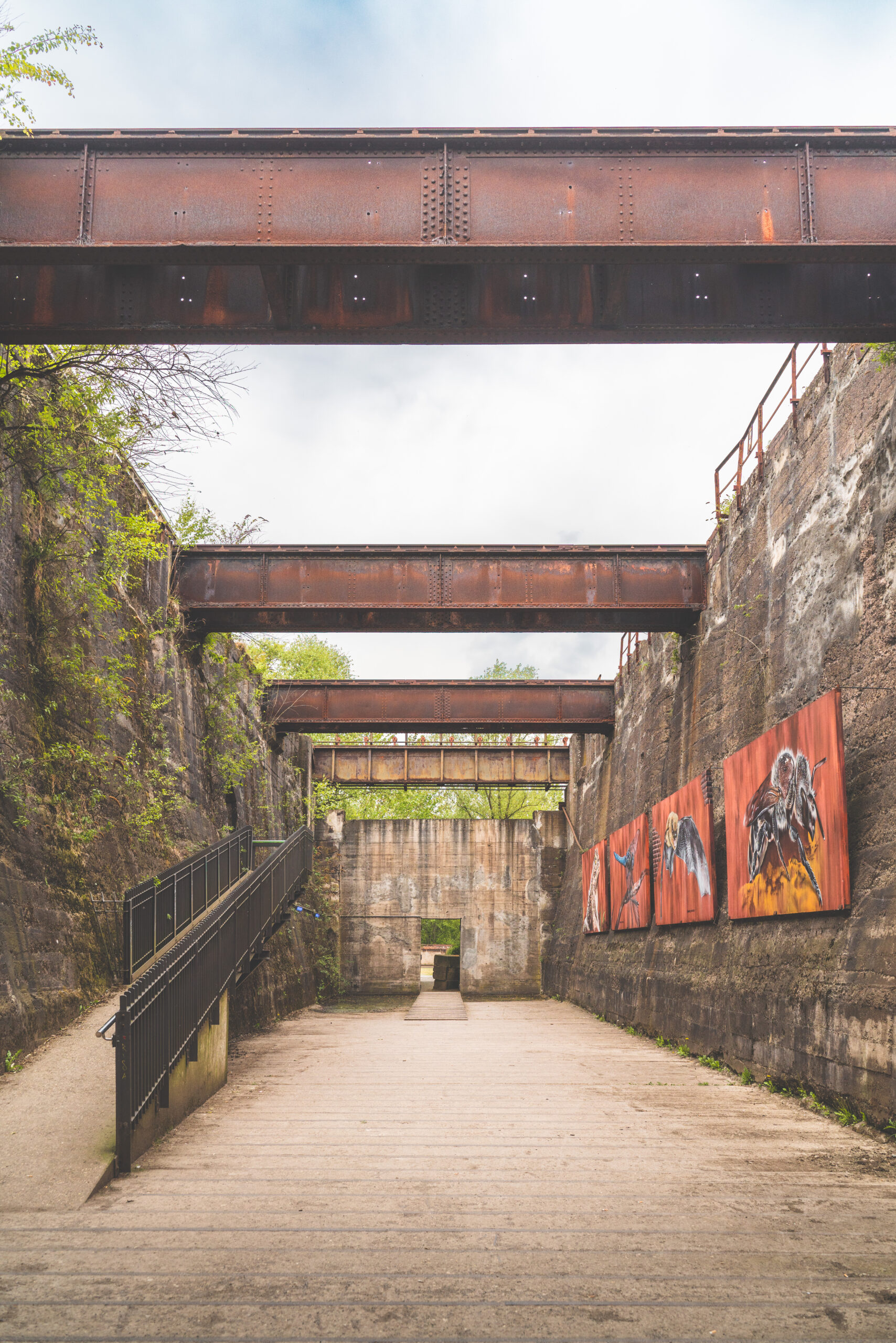
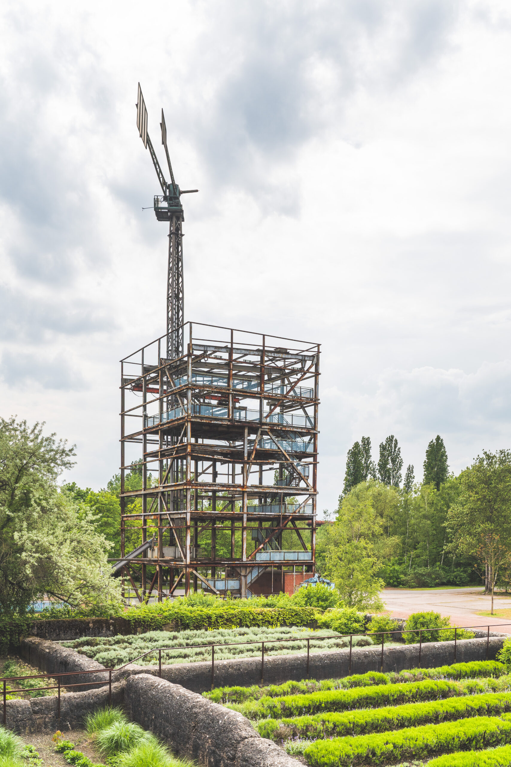
The surface of the park itself is more or less two third of Central Park. So it took me approximately two hours to go around. Although it seems to be a long time to walk, the diversity of the venue didn’t left space for boredom. The reuse and amenities of the place are so diverse and creative that I was constantly aroused and entertained. The whole walkway is thought as a contemplative promenade with thematic gardens, a guided tour through the facility, multiple vantage points and places to sit and observe.
Also the ideas of reconversion were crazily imaginative. It developed even further more during the first decades following the construction of the initial project. For instance, the gasometer is used as a diving spot, the biggest and deepest in Europe, The old brick buildings were turned into exhibition centers, museums, cafe, COVID test center, you name it. Also the huge outside spaces were arranged to host concerts and outside events. In more than thirty years of development, what was first a landscape project turned into a small village.
Innerhafen
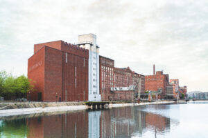
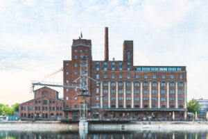
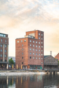
I am not gonna lie, Duisburg isn’t the best place to visit, except for Landschaftspark and the small and well manufactured industrial brick housing along with it, but still, there are some places like Innerhafen that worth going to. The old industrial harbor is also being restored and a gigantic museum specialized in German art just opened. The museum was designed by the Swiss architects Herzog and De Meuron, so not only the museography and the exhibitions are well pieced together, but also the promenade.
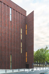
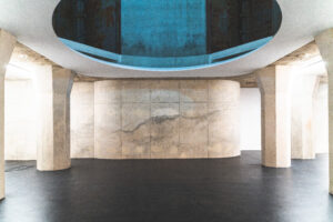
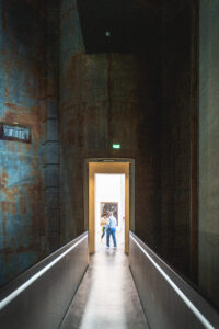
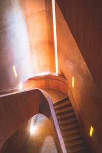
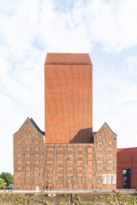
The Küppersmühle is composed with three pieces, two of them are post industrial buildings that were kept and rehabilitated, the third is a brand new extension, adjacent to it. The real tour de force from the architects, lies in the not-so-subtle shifting of spaces. Indeed, the central building is a bloc of a dozen of metallic silos. Instead of negating them, the conception lead the architects to use them as a vertical transition space, open from the ground to the roof. These silos are the focal point of the architectural experience as they set a landmark easily recognizable from the inside and from the outside.
More Art
Realistically, if you’re heading to Duisburg, know that besides the museums there is not much to do or to see. However, the city is the home of the Sculptor Gillem Lehmbruck, a local figure who was strongly influenced by the avant-grade masters. And so, there is an eponym museum right in the city center. The museum is as vast as he is interesting. Composed with three buildings connected to each other’s by a central translucent volume. At first glance the museum seems to be a collage from different architecture movements. But it was actually made in one shot by one architect : Peter Lehmbruck, the sculptor’s son. Even though looking like a huge patchwork, the promenade inside the museum is smooth, and the spaces are clear.
I was glad to discover many sculptures from Giacometti, Gormley, Dalí, Picasso, Brancusi (…) but also many German sculptors who were not as famous. Nevertheless, the temporary exhibition is the one that stroke me the most. It was crafted by Janet Cardiff and George Bures Miller, two Canadians artists who are making interactive art pieces. Meaning you can act on them as they actually react. The most relevant art work is a strange machine with an operating chair in the middle, and alongside, a big red button that says “push”. It is up to you to do it or not, but if you do it, you instantly trigger a mechanism with robotic arms that aims to torture a non figurative human. Other pieces are also true experiences created in made up worlds or stories.
Münster
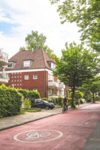
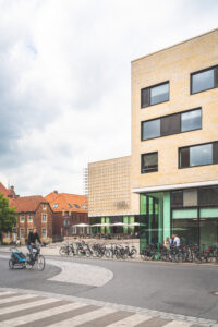
Although partly destroyed during the second war, the city took the right turn and did hell of a good work reconstructing itself. Münster was rebuild to be the most bicycle friendly city in Germany. Amongst others public facilities, they put a great effort in fabricating a cyclable boulevard around the whole city. Dedicating such great amount of urban spaces for bike paths, inevitably makes people, well, use bikes. Sometimes it’s as easy as that. It makes me think of Jan Gehl, a great Danish urbanist who wrote « in America, they build six by six roads highway to soak in the traffic, this resulted in more traffic jams, as people were simply using their cars more often »
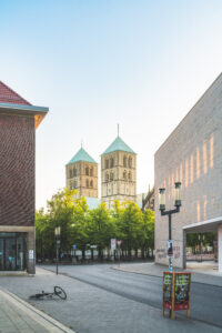
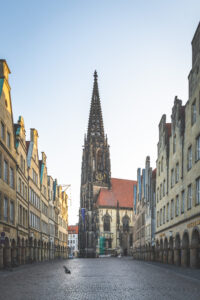
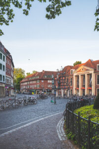
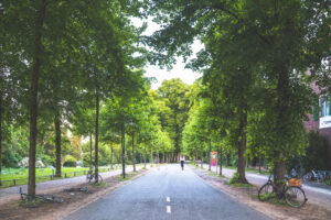
On a side note, I find it sad that we used to create cities for people, but since the fifties we’re just planning them for cars. It’s not rocket science to understand that the best cities in the world rejected the car to preserve their human scale and their identity. So why didn’t we simply analyze what is right under our nose and mimicked it ? Why did we negate and tried reinvent from scratch what our ancestors build for literally thousands of years ? Maybe it’s pride, maybe we thought we could do better, I honestly don’t know, but I do think it is time for a change.
A great place to learn
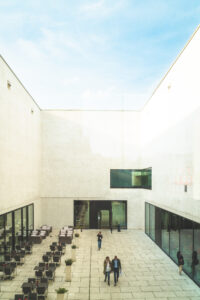
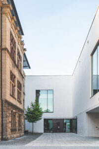
In Münster there aren’t a lot of museums, but the biggest one, the LWL is extremely well designed. The museum is split in two buildings, one from the early 20th century and an extension build in the early 21st century. The real tour de force from the architects resides in the connection of the two entities, the space in between is thought as an urban venue. A patio followed by a gigantic courtyard are mimicking an open street, which let you cross the museum any time of the day.
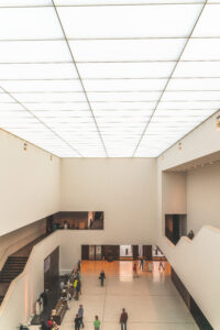
Architecture aside, the LWL holds a permanent exhibition composed with three central themes. The first theme is about the use of art as a media promoting the ideas of the church in the middle age, kind of an early stage of propaganda. The second part is focusing on how the Bourgeois from the Renaissance were showing off their social status, with portraits painted by masters, highly refined artefacts and tailored threads. That was before Instagram, Porsche and Gucci. The last theme was a collection of impressionist pieces, mainly focusing on German avant-garde artists that promoted the joie de vivre that was pre-dominent before the first war broke out.
As for the temporary exhibition, it was on a Jewish-German photographer Annelise Kretschmer. She used to work mainly on private orders, relating intimate and loosen up portraits of ordinary people. Although their portraits were really powerful, the part I liked the most were the spontaneous photos she took during her numerous travels.
Nota bene : the really sweet thing is that in Germany, they have those museums evenings that are free for everyone and last often from 6pm to 10pm. So before going in, be sure to check out the fees and the entrance hours, you might be agreeably surprised.




Leave a reply